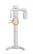
Rayscan Alpha Plus CBCT X-Ray Machine
₹27,23,215
₹35,00,000
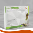
Septodont Endure Composite Restorative Kit
₹3,833
₹5,000
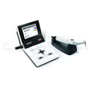
Dentsply X-Smart Plus Endomotor
₹56,754
₹1,55,605
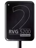
Carestream RVG 5200 RVG Sensor
₹1,01,250
₹2,00,000
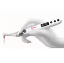
Woodpecker Endo Free Endomotor
₹18,000
₹35,000
Rayscan Alpha Plus CBCT X-Ray Machine
₹27,23,215
₹35,00,000
Septodont Endure Composite Restorative Kit
₹3,833
₹5,000
Dentsply X-Smart Plus Endomotor
₹56,754
₹1,55,605
Carestream RVG 5200 RVG Sensor
₹1,01,250
₹2,00,000
Woodpecker Endo Free Endomotor
₹18,000
₹35,000


